7 Tips to Design Dark Mode for Mobile Apps in 2021
7 Tips to Design Dark Mode for Mobile Apps in 2021
7 Tips to Design Dark Mode for Mobile Apps in 2021
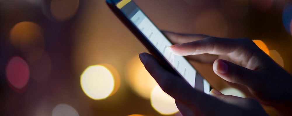
Amidst constant evolution and advancements in mobile app development, the dark mode has been at the receiving end of tremendous success. Naturally, the success has generated great demand for this mode.
Although it has been around for many years now, designing a dark mode for mobile apps is a challenging task for even the top mobile app developers in the industry. And as one of the best mobile app development companies, we, at Sapizon Technologies, can back this claim.
The idea of developing a dark mode for mobile apps was to eliminate high battery consumption, eye strain, etc. But if it is not designed correctly, the dark mode can work opposite of how it was aimed to.
Here are 7 tips that will be very resourceful in the designing of a dark mode for mobile apps, tips:
Avoid Using Saturated Colors:
Yes, saturated colors appear very attractive on light surfaces. But they can vibrate visually against dark surfaces and make them more difficult to read. Thus, making the contrast sufficient against the dark surface requires desaturation of the colors.
Therefore developers should use colors in the 200 to 50 range as they feature better readability on the dark theme surfaces. Having a lighter tone will not necessarily make your app UI less expressive. However, it will maintain the relevant contrast without causing eye strain to the user.
Distant Surfaces Must Be Darker:
Mobile app developers need to know that UI elements in dark themes can make the surface area if the layer is closer to the user. It is like a light source is cast from above that does not converge with the environment. But if the layer is distant, it receives less light and stays more in the background.
More often than not, developers can be tempted to use the present light theme while making a dark theme. Again, it makes surfaces closer and distant ones would become light while the surfaces are dark.
Thus, developers are advised to use the light theme’s primary surface color. Following this, they can use the color to create the dark theme’s primary surface color. Finally, they can make this color dark for distant surfaces and light for closer surfaces.
Utilize ON Colors for Text:
ON colors are said to be found on top of key surfaces and elements. They are normally used for text. For a dark theme, the default ON color is pure white. But since it is a bright color and would vibrate visually against dark backgrounds, Google Material Design suggests using a darker white.
This creates a theme color with the following attributes:
- The disabled text utilizes darkness of about 38%.
- Medium-emphasis text is executed at 65%.
- High-emphasis text has a darkness of more than 80%.
Minimize the Use of Bright Color Blocks:
Occasionally, developers tend to use large blocks of bright color in light themes. While it is not a problem generally, the most necessitous components could become brighter here. However, it does not work in dark themes because bright color blocks are more focused on all necessitous elements.
Avoid Using the Pure Black Color:
The dark theme of a mobile app cannot be of complete white text on black background. Because it creates a high contrast screen that can be hard to explore.
By using a shade like dark grey as the main color for the dark mode elements, this issue can be addressed. Using dark grey can be considered safe as it reduces the eye strain makes it easier for users to stare at shadows on a grey surface in comparison with a darker shade like pure black.
Ponder the Emotional Aspect of Your Design:
When you are designing the dark theme for an existing app, you need to communicate a similar range of emotions in dark mode. But you must avoid doing this here because various colors are recognized differently based on their background.
Therefore, a dark theme is unable to communicate similar to the light theme. As a result, both themes bring out various emotions. Instead of trying to resolve this, developers need to take a leaf out of this for the recognition of their product.
It is not necessary for the dark mode to always be derived from the existing light theme.
Deepen the Theme Color:
As developers, the way you moderate your text to eliminate factors like eye fatigue, the colored buttons, and accents may appear very bright. This again calls for you to change these colors for working better in a dark theme. What you can do is, first lower the brightness so the colors do not beat closer text.
Further, you can maximize saturation and give them a character. For example, if you utilize the purple straight from the light theme, it appears very bright against the closer text. In the dark theme, however, you can deepen that color so the users can focus on the text.
Closing Thoughts:
The dark mode in mobile apps tips is largely preferred by users these days as it focuses extensively on health and device battery. If you are looking for top mobile app developers to design a dark mode for your app, you can count on us.
Our team of developers is expert in designing a dark mode for applications and delivering it in minimal time with tips. We have worked on multiple such projects with have delivered effective results without compromising on functionality.